
Handling X-ray FITS files and Forward Folding
Updated:
In high-energy astronomy/astrophysics, we are often performing the task of fitting model photon spectra to counts data. I put emphasis on photon and counts because these terms represent two very different things that often get confused or interchanged with one another. Astrophysical sources emit photon fluxes. A quick refresher in Rybiki and Lightman reminds us that a differential photon flux has units photons/s/cm2/keV. While an x-ray instrument measures this photon flux, it gets converted into an electronic signal and recorded as a count rate (counts/s/PHA channel).
Where did the area and go and why a different energy? The flux was measured over the detector’s effective area and photons of different energy were redistributed as counts in different pulse height analysis (PHA) channels. The conversion between these two quantities is achieved by the detector response matrix (DRM) of the instrument. This characterizes the instrument’s effective area and energy dispersion. The effective area of a detector is basically the area that a photon of a given energy “sees” on the detector. It changes with energy because photons have shorter radiation lengths through a detector as they increase with energy. Energy dispersion is related to how photons have there energy redistributed into detector channels. For more detail, I recommend either the books by either Knolls or Aranud as they are an excellent resource for any high-energy astronomer. Let’s just say that the detection and measurement properties of the scintillator, CCD, or whatever detector is used to convert the x-rays into a digital signal are stored in the DRM.
Thus, when wanting to fit a measured x-ray count spectrum, how to we compare it with our photon model? Can we just take our counts data and use the DRM to make a photon spectrum and then fit that to our model? Not at all! Unless we have a perfectly linear response with no energy dispersion, we cannot go from counts to photons. Energy dispersion? Yeah, that is the process by which photons get dispersed into detector PHA channels. Will discuss this and more as we start to take a look at our data.
Let’s now have a look at some of the basics required to analyze x-ray data. We will start off with opening up and investigating the basic data files. This is intended to be illustrative for those who have never looked at the raw data of x-ray instruments or only used scripts and canned analysis tools in the past, but want to see what goes on the background.
import numpy as np

%matplotlib notebook
import matplotlib.pyplot as plt

import seaborn as sns

sns.set(context='notebook',style='dark')
plt.style.use(['dark_background'])
PHA Files
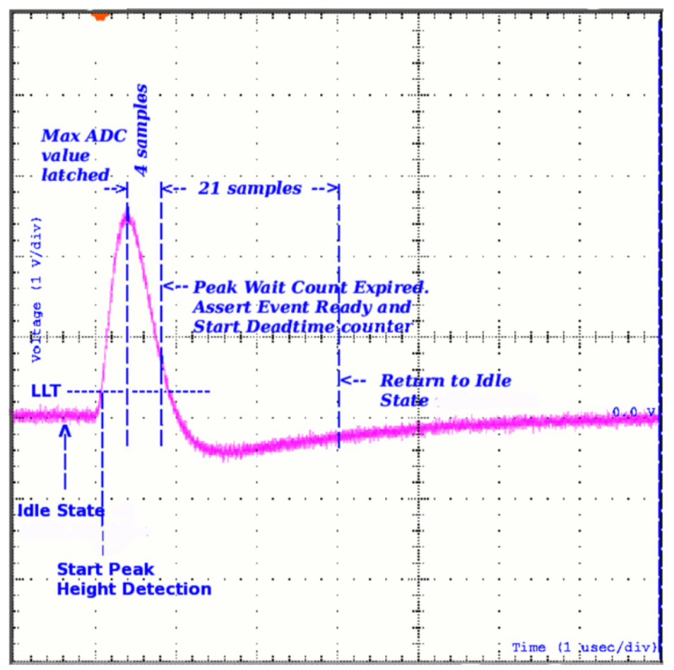
We will start out with opening up a PHA file. When a detector measures a photon, an electronic signal is created in the form of a voltage pulse. The height of this pulse corresponds (possibly non-linearly) to the energy of the incoming photon. To record that energy, some process measures the pulse height. In a perfect world, this would be a continuous measurement, but for several reasons (finite energy resolution of detection medium, CPU power, data storage), this is not possible. Therefore, boundaries or channels corresponding to a range of energies are set and the pulse height is discriminated to see which bounds it lies between. Thus, a count is measured for that photon in a PHA channel.
From Meegan et al. 2009, we can visualize this process:
As photons come in over time and with different energies, a spectrum of counts is built up. The detection process, data acquisition, and data reduction processes differ across instruments, but most of them produce public data files for observations in the Flexible Image Transport System (FITS) file format. The type of file is a PHA FITS file. It is a binary file with text headers that contains regulated keywords so that people and analysis tools can have a common format and understand exactly what is in the data. This format is called OGIP. I’ll leave it up to you to investigate all the details of the files, but for our purposes we will now try and extract the counts spectrum from a PHA FITS file.
The Astropy collaboration has taken over the python code to read FITS files and it is the tool I will utilize here. First, let’s import astropy’s FITS reader.
import astropy.io.fits as fits
I’m going to work with some sample data from the Fermi Gamma-ray Burst Monitor (GBM) that has been reduced from its non-standard format into OGIP compliant FITS files. Let’s open up a PHA file.
pha = fits.open('example.pha')
pha.info()
Filename: example.pha
No.    Name      Ver    Type      Cards   Dimensions   Format
  0  PRIMARY       1 PrimaryHDU      29   ()
  1  SPECTRUM      1 BinTableHDU    101   1R x 10C   [D, D, I, 128I, 128E, A, D, 128D, 27A, 27A]
  2  EBOUNDS       1 BinTableHDU     44   128R x 3C   [I, 1E, 1E]
  3  GTI           1 BinTableHDU     43   1R x 2C   [D, D]
We can see that there are four extensions in the file. We will primarily be interested in the SPECTRUM and EBOUNDS extensions which contain the spectral data.
The Spectrum Extension
First, we will extract the spectrum extension. There are various ways to access data in a fits file that depend of speed, ease of use, etc. I encourage to read the astropy documentation to understand these different methods. Here, I’ll just access the extensions by keyword.
spectrum_ext = pha['SPECTRUM']
spectrum_ext.header[:30]
XTENSION= 'BINTABLE'           / Binary table extension
BITPIX  =                    8 / Bits per pixel
NAXIS   =                    2 / Required value
NAXIS1  =                 1873 / Number of bytes per row
NAXIS2  =                    1 / Number of rows
PCOUNT  =                    0 / Normally 0 (no varying arrays)
GCOUNT  =                    1 / Required value
TFIELDS =                   10 / Number of columns in table
TTYPE1  = 'TSTART  '           / Label for this field
TFORM1  = 'D       '           / Data format of this field
TTYPE2  = 'TELAPSE '           / Label for this field
TFORM2  = 'D       '           / Data format of this field
TTYPE3  = 'SPEC_NUM'           / Label for this field
TFORM3  = 'I       '           / Data format of this field
TTYPE4  = 'CHANNEL '           / Label for this field
TFORM4  = '128I    '           / Data format of this field
TTYPE5  = 'STAT_ERR'           / Statistical error
TFORM5  = '128E    '           / Data format of this field
TTYPE6  = 'ROWID   '           / Unique identifier for each spectrum
TFORM6  = 'A       '           / Data format of this field
TTYPE7  = 'EXPOSURE'           / Label for this field
TFORM7  = 'D       '           / Data format of this field
EXTNAME = 'SPECTRUM'           / Extension name
TELESCOP= 'GLAST   '           / Name of mission/satellite
INSTRUME= 'GBM     '           / Specific instrument used for observation
HDUCLASS= 'OGIP    '           / Format confirms to OGIP standard
HDUCLAS1= 'SPECTRUM'           / PHA dataset (OGIP memo OGIP-92-007)
HDUCLAS2= 'TOTAL   '           / Type of data stored
HDUCLAS3= 'COUNT   '           / Further details of type of data stored
HDUCLAS4= 'PHA:II  '           / Single PHA dataset
There is a lot of information in the header. The important items for our current tasks are the TTYPES. These are the data stored in the extension. Let’s grab some of the data.
The rate is an array the size of the number of PHA with the count rate in each channel.
dNc_dt = spectrum_ext.data['RATE'][0] #counts per second
Next, we get the exposure of the time interval. Note that this is not the duration of the interval that may be in the header of the FITS file. It will be shorter. Remember how we figure out the energy of the photon by capturing the pulse height of the electronic signal? This takes a finite amount of time during which the instrument is not recording new counts. Thus, when the instrument is off, we call this dead time. The difference between real time and dead time is called exposure and to convert between rates and counts, we multiply by exposure.
dt = spectrum_ext.data['EXPOSURE']
Nc = dNc_dt * dt
The EBOUNDS Extention
Now that we have our rates, we need to know what calibrated energies to which the channels correspond. This is not converting the rates to a photon flux. It is simply a simple channel to energy conversion for visualization.
Let’s go into the EBOUNDS extension and extract the energy bounds of each channel.
ebounds_ext = pha['EBOUNDS']

energy_min = ebounds_ext.data['E_MIN']
energy_max = ebounds_ext.data['E_MAX']

edges = np.append(energy_min,energy_max[-1])

# the width of the channels
dE = np.diff(edges)
We will define a little function to plot rates.
def rate_plot(ax,bin_edges,rate,label=None):

    ax.step(bin_edges[:-1],rate,where='pre', label=label)

    ax.set_xscale('log')
    ax.set_yscale('log')

    ax.set_xlabel('Channel Energy')
    ax.set_ylabel(r'$\frac{d N_c}{dt dE}$')
dNc_dtdE = dNc_dt/ dE

fig, ax = plt.subplots()

rate_plot(ax,edges,dNc_dtdE)
<IPython.core.display.Javascript object>

There are a few things that we can take note of in this plot. First, this is the energy dispersed spectrum. It has the shape of the true spectrum convolved with both the effect of energy dispersion and the effective area of the detector. In this example, the effective are falls off above ~300 keV.
At higher energies, the large spike is due to overflow. Counts that are above the energy threshold of the instrument are stored here. In an analysis, you want to be sure to exclude these channels and any channels that are not viable for the analysis, i.e, those containing calibration defects etc.
The Instrument Response
Now that we have extracted our count rate data, how do we get back to the emitted photon spectrum? As we will see, we cannot, but, we can guess the solution and test it. But before we get to this, let’s examine what the response files are like.
Most x-ray analaysis instrument responses are stored in FITS files in one of two formats.
- Separated energy disperison (RMF) and effective area (ARF) files
- or a combined RMF+ARF file.
The way they are stored depends on what is suitable for the instrument, but the end product is the same, a matrix that describes the energy disperison and effective are as a function of both photon energy and PHA channel.
Let’s open up a response file.
rsp_file = fits.open('example.rsp')
rsp_file.info()
Filename: example.rsp
No.    Name      Ver    Type      Cards   Dimensions   Format
  0  PRIMARY       1 PrimaryHDU      37   ()
  1  EBOUNDS       1 BinTableHDU     57   128R x 3C   [I, E, E]
  2  SPECRESP MATRIX    1 BinTableHDU     53   140R x 6C   [E, E, I, I, I, PE(128)]
We’ll work with a response file that combines the RMF and ARF together. The EBOUNDS extension is similar to the one found in the PHA file. But we should always check with the instrument documentation if we see differences between the two. For example, things like onboard gain corrections can shift the energy boundaries up and down. This should be accounted for, but it is not always the case. Know your data!
The second extension is the SPECRESP MATRIX which contains the dispersion matrix. The OGIP standards specifiy a rather complicated format for storing the matrix so that the files are not too large. Basically, there are a lot of entries that are zero. The algorithm for reading these matrices is rather complicated and not important for our discussion, but an interested reader can look at how it is done in 3ML here.
Instead, we will use 3ML to read the response matrix so that we can get to the main point.
from threeML.plugins.OGIP.response import OGIPResponse

rsp = OGIPResponse('example.rsp')

rsp.plot_matrix();
<IPython.core.display.Javascript object>

What do we have? The region of high area on the diagonal is the main part of the response. It is called the photopeak, and if all the energy of an incoming photon was captured and measured perfectly, then this is all we would see. The lines and non-zero area outside of the photopeak are the result of compton scattering inside the detector and when a photon does not deposit all of its energy inside the detector. These effects can be investigated in textbooks, but the main point is that this response takes into account those effects and translates them to our observed spectrum.
Let’s have another look at the response. Let’s extract the “monte carlo” or the photon energy and take thier mean.
mean_mc_energy = np.mean( np.vstack((rsp.monte_carlo_energies[:-1],
                                     rsp.monte_carlo_energies[1:])).T,axis=1)
Now, let’s grab some of the rows from the channel side of the matrix.
data = [rsp.matrix[i,:] for i in range(0,128,4)]
from python_tricks.stack_plot import stack_plot

fig = stack_plot(mean_mc_energy,
              *data,
              alpha=.7,
              scale=.1,
              x_scale='log',
              cmap='viridis_r')
<IPython.core.display.Javascript object>

This is simply another view of the matrix. Each color is a different PHA channel distributed as the photon energy (x). The distribution is simply the probability that a photon of “x” energy will be measured in this channel multiplied by the effective area at that energy. This illustrates why we cannot convert the count rate spectrum back to a photon spectrum. We only know what the true energy of the measured photon is probabilitstically!
Then how do we figure out what the true spectrum is? We have to guess. The method that we will use is called forward folding. Basically the process is:
- assume a photon model spectrum with a set a variable parameters
- convolve this spectrum with the instrument response to produce counts in the instruments energy space
- compare these trial counts with the observed counts statistically
- iterate until a convergence criterion is met.
Thus, we can only go one way, from photons to counts. Not the other way around. This is the curse of energy dispersion, but there is no way around it. Let’s go through the process just to illustrate how it works.
First we will define a power law differential flux function, then its integral via Simpson’s rule, and finally calculate the photon fluxes of the photon model for each photon energy bound in the response matrix. These will be the “true” fluxes of the assumed photon model.
def power_law(energy, norm, index):

    return norm * np.power(energy/100.,index)

# for ease
def differential_flux(e):

    return power_law(e, .01, -2)

# integral of the differential flux
def integral(e1, e2):
    return (e2 - e1) / 6.0 * (differential_flux(e1) + 4 * differential_flux((e1 + e2) / 2.0)+ differential_flux(e2))

# true photon fluxes integrated over the photon bins of the response
true_fluxes = integral(rsp.monte_carlo_energies[:-1], rsp.monte_carlo_energies[1:])  # dNp/(dt dA)
We can see that this spectrum looks like a power law:
fig, ax = plt.subplots()

ax.step(rsp.monte_carlo_energies[:-1],true_fluxes,where='pre')

ax.set_xscale('log')
ax.set_yscale('log')

ax.set_xlabel('Photon Energy')
ax.set_ylabel(r'$\frac{d N_p}{dt dA}$');
<IPython.core.display.Javascript object>

We still have a differential area in our flux and have not accounted for dispersion. Thus, we must convolve these true fluxes with our matrix. The matrix has units of area (cm\(^2\)) accounting for the effective area of the detector. The operation is simply a dot product between the vector of photon fluxes we just computed and the matrix. Thus:
folded_counts = np.dot(true_fluxes, rsp.matrix.T)
Now we can compare our assumed spectrum with the real data.
fig, ax = plt.subplots()

rate_plot(ax,edges,dNc_dtdE,label='real data')
rate_plot(ax, edges,folded_counts/ (dE),label='modeled data')
ax.legend();
<IPython.core.display.Javascript object>

We can see how the effective area and effects of energy dispersion have altered the shape of our power law. This is why it can be difficult to spectrally model x-ray spectra measured by instruments that exhibit strong energy dispersion. If an empirical spectrum is assumed, how can we be sure it that there is not a better spectrum to assume? The non-linear changes from photon to count space are not intuitive. It may be better to have a good idea about the model you want to propose before fitting. Is the model physical? Why chose this empirical model over another? Will the model have features that mistake calibration effects for physical effects? All of the above require practice, consulatation with instrument experts, and proper statistical tools to overcome.
I haven’t gone over how to fit these data, but with these insights, you should feel comfortable opening x-ray data FITS files and exploring. There are details that can be followed up in instrument manuals, and a literature search. Luckily, many of these procedures are automated in x-ray analysis software. I’ve used example code from 3ML which can be used to fit data across many wavelengths.
Leave a Comment